Using Whitespace In Your Website
Whitespace has often been used as an effective marketing and design strategy. In this article, we’ll talk about whitespace and how it can be used in your website.
What is Whitespace?
Whitespace, or negative space, is the space between elements on a page. It can be the space surrounding website graphics, the space between blocks of text, or the space between lines of text (line spacing).
While some see whitespace as a waste of space that could be used to add additional information, it can be an essential element in an effective design. From a design perspective, whitespace can be used to draw attention to a particular element and to make it stand out and to lead the viewer’s eye towards relevant content.
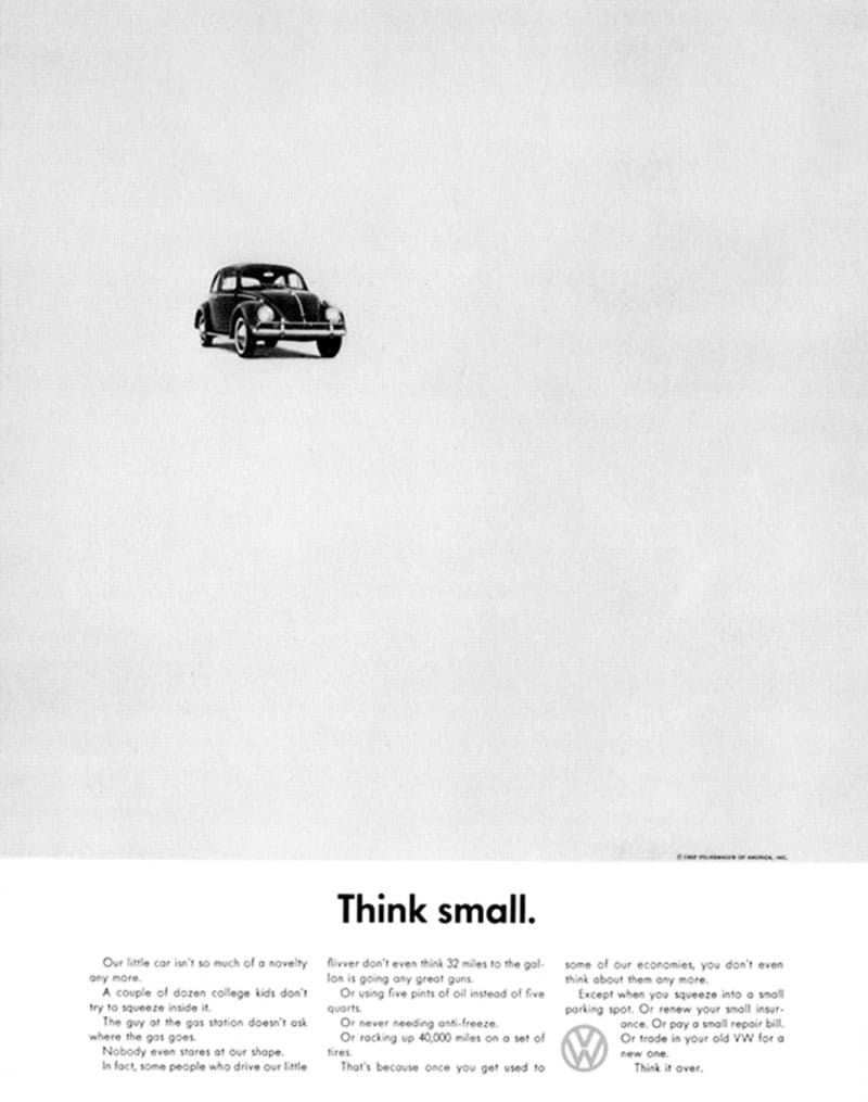
One of the earliest examples of this is Volkswagen’s brilliant “Think Small” campaign of the ’60s.
Volkswagon, or rather “Doyle Dane Bernbach”, Volkswagen’s marketing agency, used a full-page newspaper page with a tiny image of a Volkswagen, combined with equally brilliant ad copy.
Even their early TV ads were minimalistic. One solitary car, minimal voice over.
Over the last few years, the use of whitespace has transitioned to websites.
Minimalistic
One of the most recognized brands that effectively use whitespace is Apple. This comes as no surprise, with the minimalistic philosophy of founder Steve Jobs. Steve believed in a beautiful and simplistic design. If you need convincing, simply take a look at the original iPod or the Magic Mouse.

As with their products, there is nothing on the website that is not needed.
Whitespace does not have to be white
Of course, whitespace does not have to be “white”. Take. for example, this ad by Heinz ketchup. With only 2 design elements, the viewer is led directly to the ad copy, which emphasizes the bottle constructed of sliced tomatoes.
Luxury and Sophistication
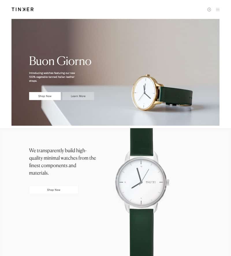
Another great example of effective whitespace (and minimalistic design) is Tinker Watches. Even their logo is very simplistic. This whole presentation lends itself to an air of luxury and sophistication.
Everything about this is beautifully done, from their branding to the design of their website, to the imagery that they use. Clean, simple and to the point.
To sum up, less is often more. A website does not need to be cluttered. Very often, a very simplistic and minimalistic design can be the best course of action.


