The Right Image For The Right Purpose
Have you ever been lazy when creating images for Social Media? I have. It’s all to easy to create a single image, and then spread it around your various social media networks, like it’s a “one size fits all” thing.
But guess what? It isn’t.
Every social media channel has a specific size image that works best for that channel, and by optimizing your images for individual networks, you are going to find that you have better success than being, well, lazy.
For this article, I am going to create an image with an inspirational quote. You’ve all seen these, so this is nothing new, expect maybe for the fact that I will be creating a separate image for each channel. I use Photoshop to do these type of images. If you don’t have Photoshop, or are uncomfortable using it, a great alternative is Canva. They have lots of great templates set up, and it’s a pretty easy application.
This is not a tutorial. This post is simply to give you an idea of what size images look best for each Social Media network.
If you would a tutorial, just let me know in the comments. I can also provide the PSD templates if there is enough interest.
So let’s get started.
Facebook images should be 940px X 788px.

Twitter images should be 1024px X 512px. You can see here how the elements needed to be reworked a bit to fit the new dimensions.

Pinterest posts should be vertical and set at 735px X 1102px. Again, the elements required some re-arranging.

Google+
Google+ images are the smallest of all the social networks. Their images should be 497px X 279px.

Instagram images are square, and should be set at 640px X 640px.

So there you have the image sizes for 5 of the main social media networks.
Now let’s take a quick look at why you should be using a different image for each network.
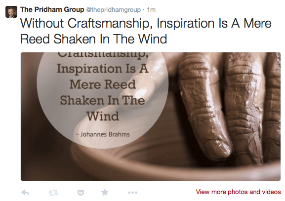
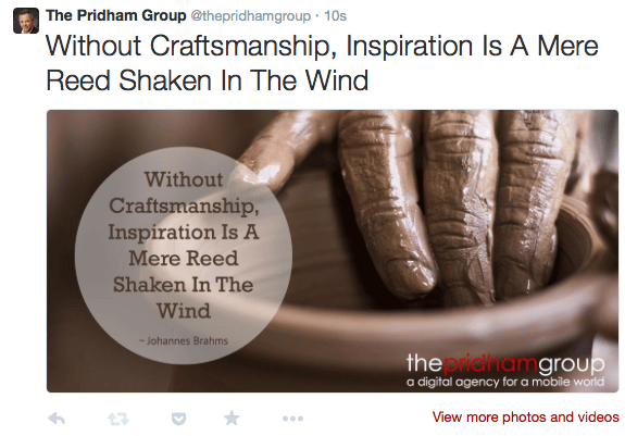
Here are 2 posts from Twitter. In the first post, I lazily used the image created for Facebook. In the second post, I used an image properly size for Twitter. You can see the difference it makes. In the first post, the words of the quote are cut off, and my logo is nowhere to be seen. In the second post, everything is visible, the way it should be.

Wrong

Correct
I know creating a different image for each network is a bit more work, but it is worth it if you are using those social networks to promote your business.
What are you thoughts on it?
