Google Expands Mobile-Friendliness As A Ranking Signal
What used to be a “nice to have” has now become a “must have”, especially when it comes to Google and your website.
Google has officially stated that, starting April 21st, they will be “expanding our use of mobile-friendliness as a ranking signal”.
From their blog:
Starting April 21, we will be expanding our use of mobile-friendliness as a ranking signal. This change will affect mobile searches in all languages worldwide and will have a significant impact in our search results. Consequently, users will find it easier to get relevant, high quality search results that are optimized for their devices.
What is “mobile-friendliness”?
A mobile-friendly website (commonly known as a “responsive” website) is one that that will “adapt” (respond) to whatever device it is being displayed on, whether it be a desktop computer, a laptop, a tablet or a smartphone.
It mean that “pinching and zooming” is not required, that text is easily read, and that links are easily “tapped”. It also means that it avoids software (E.G. Flash) that is not common on mobile phones.
You can read more about this on Google’s Blog.
What does this mean to you as a website owner?
If your website is not mobile-friendly, it will be now ranked lower than websites that are mobile-friendly, meaning you may soon seeing your website dropping down in Search Engine Results.
Google, states in fact, that this will have a significant impact in our search results.
You can read more about Google’s announcement here.
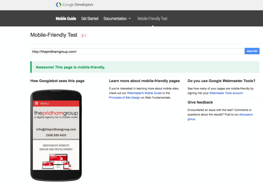
If you are not sure whether or not your website is mobile-friendly, Google will test it for you with their Mobile-Friendly Test, which we highly recommend.
What you want to see is something like this:

If you don’t, and instead you see this …

… then it’s definitely time to look at taking steps to make your website mobile-friendly.
What to do about it?
If your website is not mobile-friendly, I would first suggest talking to a digital agency. If you have an existing agency that you have a good working relationship with, they can explain the best options for you. If your website is based on a pre-made theme, and you want to continue with that option, then you will need to search for one that is built in a responsive manner.
And, of course, we can help. If you would like to talk to us about your website, feel free to contact us or leave a comment below, and we can set up a time to review your website and suggest some options.
